Quick Start
Keycloakify is a tool for creating custom Keycloak themes, enabling you to modify the appearance and behavior of Keycloak's user interfaces. This includes:
Login Theme: The UI for login and registration pages, displayed to users when they attempt to log in or sign up.
Account Theme: The account management interface, where users can update their email, change their password, and manage other account settings.
Email Theme: The templates used by Keycloak for automated emails, such as email confirmation or password reset notifications.
Admin Theme: The Admin Console interface, used by administrators to configure Keycloak.
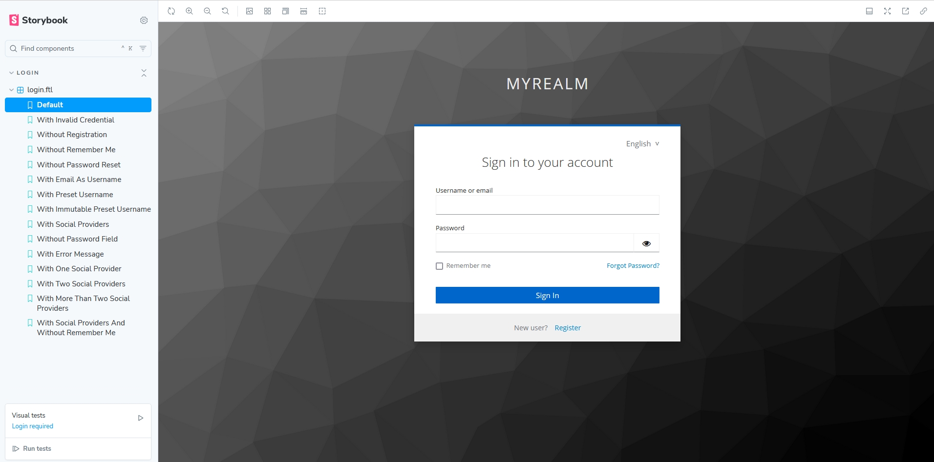
For a visual preview of these UIs as they appear with Keycloak's built-in theme, visit the Storybook demonstration:
Whether you need to apply light CSS-level customizations to the built-in UIs or perform deeper redesigns at the component level using React, Angular, or Svelte, Keycloakify is the tool to achieve your goals. If you’d like to see Keycloakify in action, check out Neon. Clicking "Login" or "Sign Up" will take you to their Keycloakify-themed login pages.
Why Choose Keycloakify?
You might be wondering why you would need a third-party tool like Keycloakify to create your custom UIs instead of relying solely on Keycloak's built-in theming system. Here are a few reasons:
🚀 Leverage Modern Frontend Technologies: Keycloakify enables you to use TypeScript, React, Angular, Svelte, and any styling solution or component library you prefer, such as Tailwind, MUI, shadcn/ui, or plain CSS.
🛠️ Streamlined Testing: Keycloakify makes it easy to test your theme both inside and outside Keycloak, with hot reloading for a smoother development experience.
📦 Automated Theme Bundling: Keycloakify bundles your theme into a JAR file, ready to import directly into Keycloak.
🔄 Version Compatibility: Themes generated with Keycloakify are backward compatible with Keycloak versions as far back as 11 and are .
✅ Built-In Real-Time Validation: Keycloakify includes real-time frontend validation by default. For example, users receive instant feedback, such as "The password must be at least 12 characters long," rather than waiting until they press the submit button.
💬 Community Support: We're here to help! If you're stuck or need guidance, reach out through our Discord channel or GitHub issues. We respond quickly and are happy to assist.
If you’re still unsure or want a better understanding before committing to using Keycloakify, check out this guide:
How does Keycloakify work?Pick Your Framework: React, Angular, or Svelte
Keycloakify supports React, Angular, and Svelte, allowing you to work with the framework you're most familiar with. If you're only making CSS-level customizations to Keycloak's built-in theme, any of these frameworks will work. For a smoother experience, React is recommended, as it has the most complete integration.
For Angular and Svelte users, a few considerations apply:
Email Templates: These must be created using React or FreeMarker; Angular and Svelte are not supported.
Account Themes: , requiring additional adjustments.
Admin Themes: Only React supports custom Admin UIs. However, since the Admin UI is only seen by the Keycloak instance administrator, it is rarely customized.
Angular Setup: . Themes must either be standalone projects or a subproject in a monorepo.
React provides the most seamless experience, but Angular and Svelte are fully supported for login and account themes with some extra effort, which covers the needs of most projects. Choose the framework that best suits your project and expertise. If you have any questions or concerns, feel free to ask us on our Discord channel.
Quick Start
Before futher reading, some practice!
Let's create a story for the Login page and run .
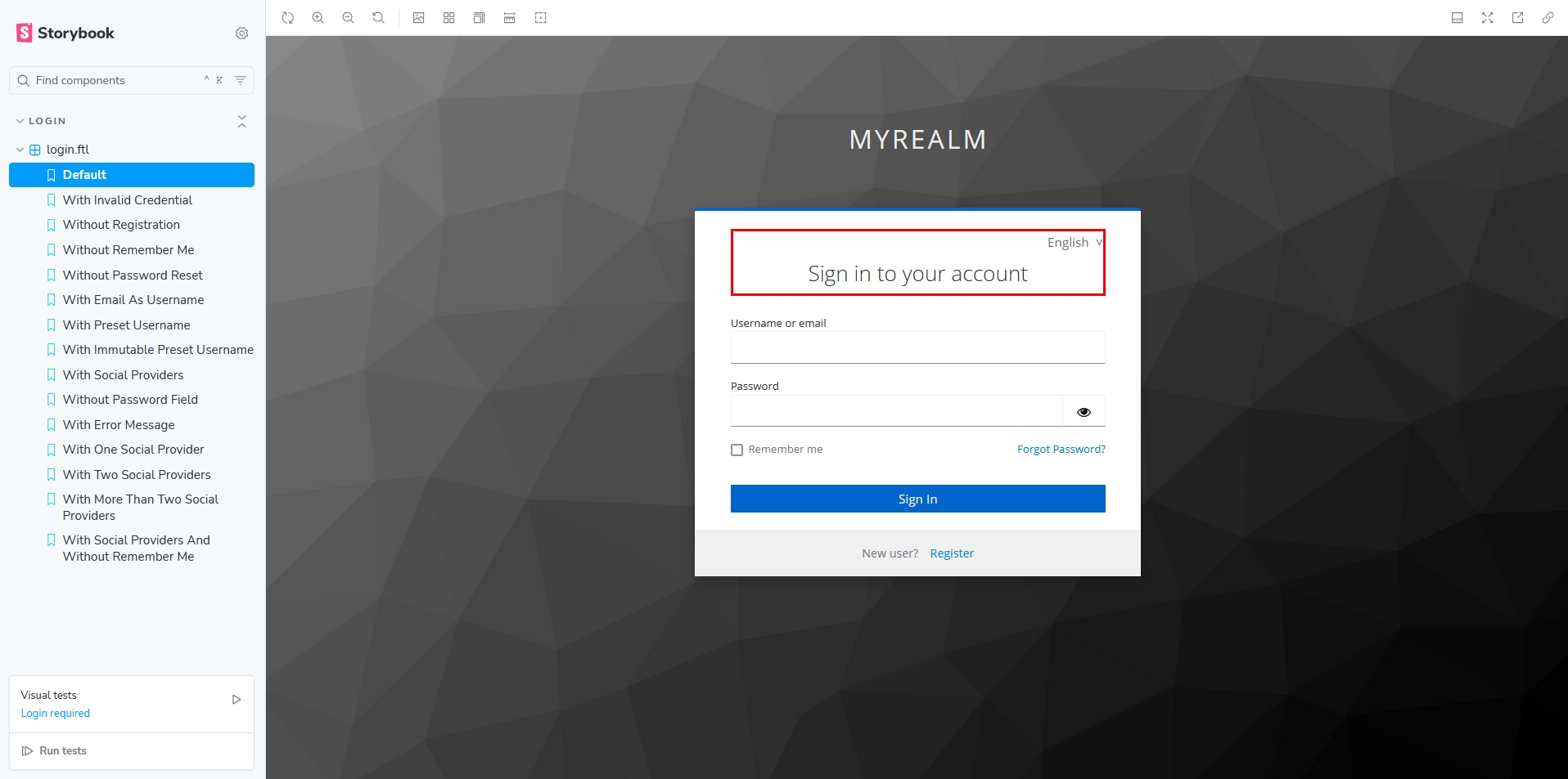
You should now be able to see the login pages in different scenarios:
Now, let's apply our first CSS customization.
Create this file:
Make sure your main.css is imported here:
Continue to the Testing Your Theme section to learn how to maximize Keycloakify’s capabilities:
Testing your ThemeLast updated

