On the console will be printed all the instructions about how to load the generated theme in Keycloak
The first approach is to only customize the style of the default Keycloak login theme by providing your own class names.
src/index.tsx
import { KcApp, defaultKcProps, getKcContext } from "keycloakify";
//We assume the file contains: ".my-class { color: red; }"
import "./index.css";

const { kcContext } = getKcContext();

if( kcContex === undefined ){
    throw new Error(
        "This app is a Keycloak theme" +
        "It isn't meant to be deployed outside of Keycloak"
    );
}

reactDom.render(
    <KcApp
        kcContext={kcContext}
        {...{
            ...defaultKcProps,
            "kcHeaderWrapperClass": "my-class",
        }}
    />,
    document.getElementById("root"),
);
The above snippet of code assumes you are in a react project wich only purpose is to be a Keycloak theme.
But if you want to make your keycloak theme an integral part of a preexisting React app you would apply the following modification to the above snipet:
+import { App } from "<you know where";
 import { KcApp, defaultKcProps, getKcContext } from "keycloakify";
 import "./index.css";

 const { kcContext } = getKcContext();

-if( kcContex === undefined ){
-    throw new Error(
-        "This app is a Keycloak theme" +
-        "It isn't meant to be deployed outside of Keycloak"
-    );
-}

 reactDom.render(
+    kcContext === undefined ?
+        <App /> :
         <KcApp
             kcContext={kcContext}
             {...{
                 ...defaultKcProps,
                 "kcHeaderWrapperClass": myClassName,
             }}
         />,
     document.getElementById("root"),
);
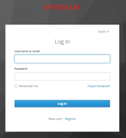
Result: MYREALM is red
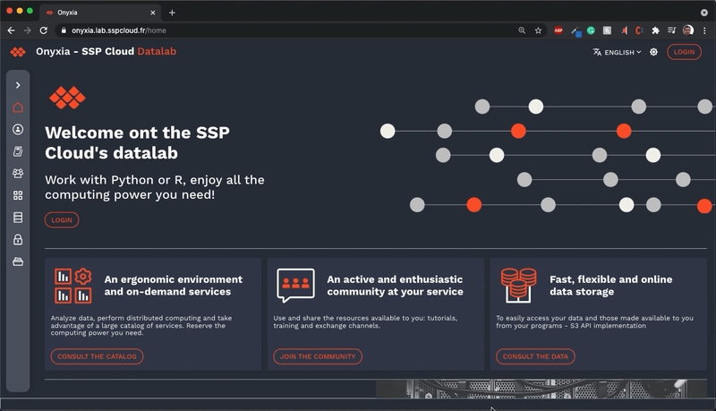
Real world example
To give you an idea of what you can already achieve by only customizing the style the style,
If you want to go beyond only customizing the CSS you can re-implement some of the pages or even add new ones.
If you want to go this way checkout the demo setup provided here. If you prefer a real life example you can checkout onyxia-web's source. The web app is in production here.